English
Duration
Term
Role
Tool
01/2021 - 02/2021
2 Month
UX Design, UX Research, Prototyping
full
BACKGROUND
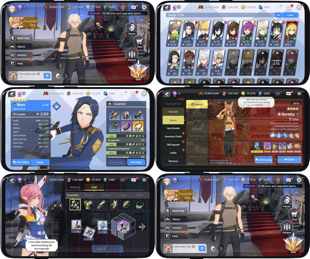
What is Lord of Heroes?
Developer
Period
Service in
Downloads
Clover games
2020.03 - Present
143 countries (10 Languages)
Total 1M+
CHALLENGE
Identifying problems of the current design
The redesign of the game UI is about empowering the current content with better user experience. I hope the new design could support learnability for novice players and efficiency for expert players.
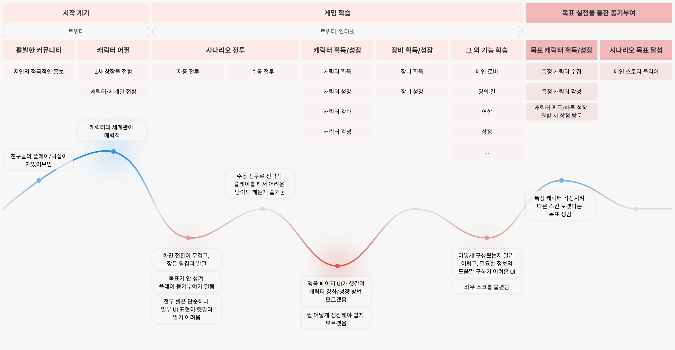
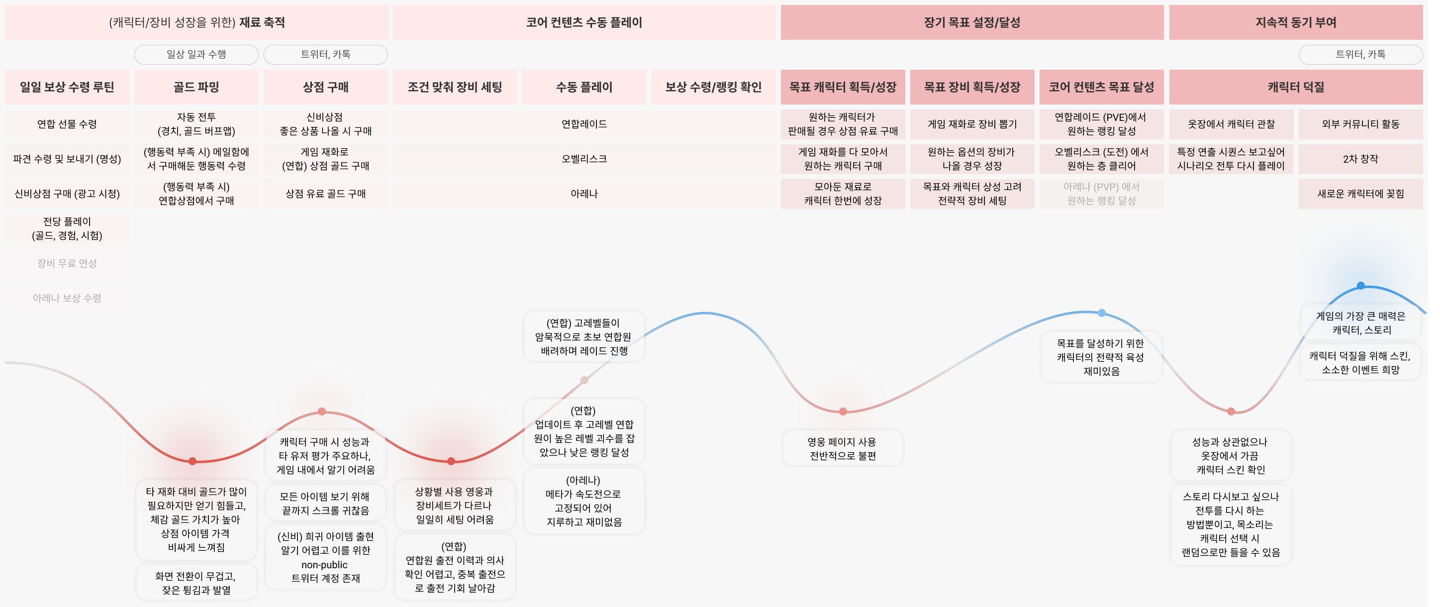
Before jumping directly into fix mode, I conducted a diary study to myself for 7 days and a usability test with 3 expert players. Through research, I could organize each player's routine context and pain point about main features. I started into design after finding players' needs and increasing game immersion.
Process
INSIGHTS
General player type of LOH ─ Subculture fangirls who also love playing games
• Women in 20s - 30s who usually communicate with similar groups on Twitter
• They love both subculture activities (about manga, animation, etc.) and games
• They are fascinated by specific characters, consume money for them, and search for new targets to fit their taste
• They feel uncomfortable with character design in Korean famous RPG because those are too sexual
Players enjoy strategic consideration about the battles and feel it fun · important
• Novice players found manual control attractive. Expert players enjoy hard contents that have to consider combinations of squad and equipment (Alliance raid, Obelisk)
• Players set different squads and equipment in battles depending on the contents. But they should have a long journey to go to the heroes page when they want to change equipment.
• In general, players checked and grew heroes toughly and uncomfortably on the Heroes page.
• When bought heroes, public evaluation and performance were important but those couldn't be seen in the shop
• At Alliance raid, players couldn’t know ‘currently participating player’. It blocks tactical participation from other members.
Characters and narratives provide the most appeal for players among LOH content
• Players started LOH and retained there because Character and narrative appeal to them.
• Players easily learn LOH from their surroundings because the game spread in subculture community
• Players want to know detail about characters and narratives though they're not related to playing.
Novice players learn contents hard way through UI, and Expert players use it inconvenient
• Novice players understand simple game rules confusingly, and hard to set goals for retaining LOH
• Expert players cannot find information fastly what they need or don't want to use some UI because of inconvenience.
HOW MIGHT WE HELP PLAYERS IMMERSE MORE THEMSELVES IN LOH?
How to
remove
obstacles for
strategic play
How to
give off
more Characters charm
How to
design UI
easy to learn & efficiency
SOLUTION HIGHLIGHT
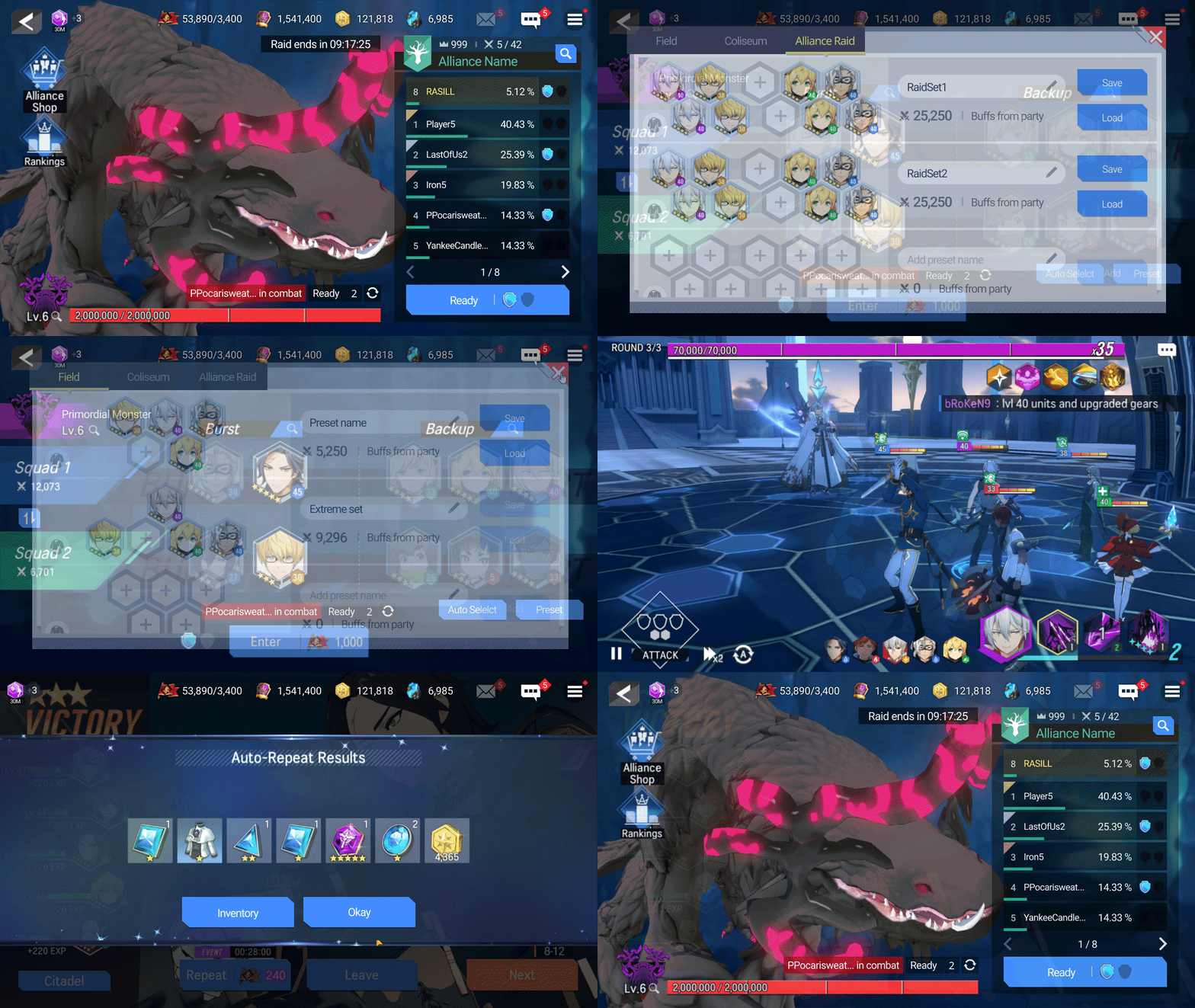
Improve for easy tactical consideration for battle
Features relevant with Battle
Area map, Battle ready, Alliance raid, Arena
• Provide 'presets' on heroes and battle-ready. Players use it to save and load combinations of squads/equipment they used to.
• Mark 'current participating player' on Alliance raid.
Players see timing and strategically decide to participate in raids. Also, they will never lose their raid tickets again. (2 tickets per day)
• Mark 'heroes attack turn' on auto-play HUD. Players observe automatic play and intervene when manual control is required.

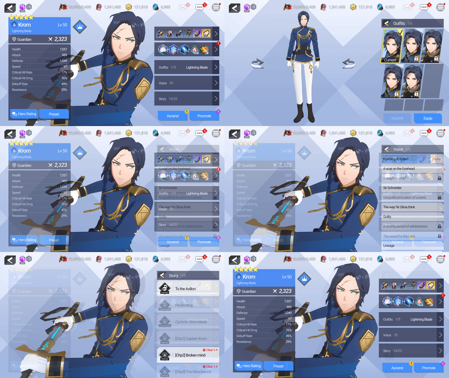
Heroes
• Improve the layout/flow and Add a sorting function.
Players can view 18 heroes at a glance (currently only 6 heroes) and sort by their important criteria.
• Accurately displays missing information on Heroes list. Players can view all the essential information at a glance that expert players care about.
• Adds total combined stats on Heroes detail page.
(Currently, there are no total stats.) Also, Players can check detailed formulas on the Skill/Equipment page.
• Add 'Heroes rating' to read public evaluation. Currently, it only could use on the universe page. Players refer to various information conveniently and it promotes communication among themselves.
• Players also can edit 'presets' on the heroes page.
Hero growth is an essential part of strategic play.
More easily Collect heroes and Do fandom activities
Heroes
• Access everything about heroes on one page. (Such as voices, skins, and dialogues) Players can be more immersed in it.
Joining Fandom is one of the most important activities for players.
• Suggest Dev team host creator events that players can participate in on Twitter. It motivates them to play LOH and promote to the audience.
Provide an optimal UI experience for everyone

Main Lobby
• Use UI to enter each feature and provide an immersive experience by using 'camera dolly in-out', 'communication with heroes'. Current way (touching character modeling) is hard to find information and inconvenient though it provides exploration and immersion.
• Give the players the Hamburger menu. they can access all the contents from anywhere.
• About Preferences, Questline, and documentation
Improve layout for getting more information easily on one page, group similar contents for easy understanding.
Shop
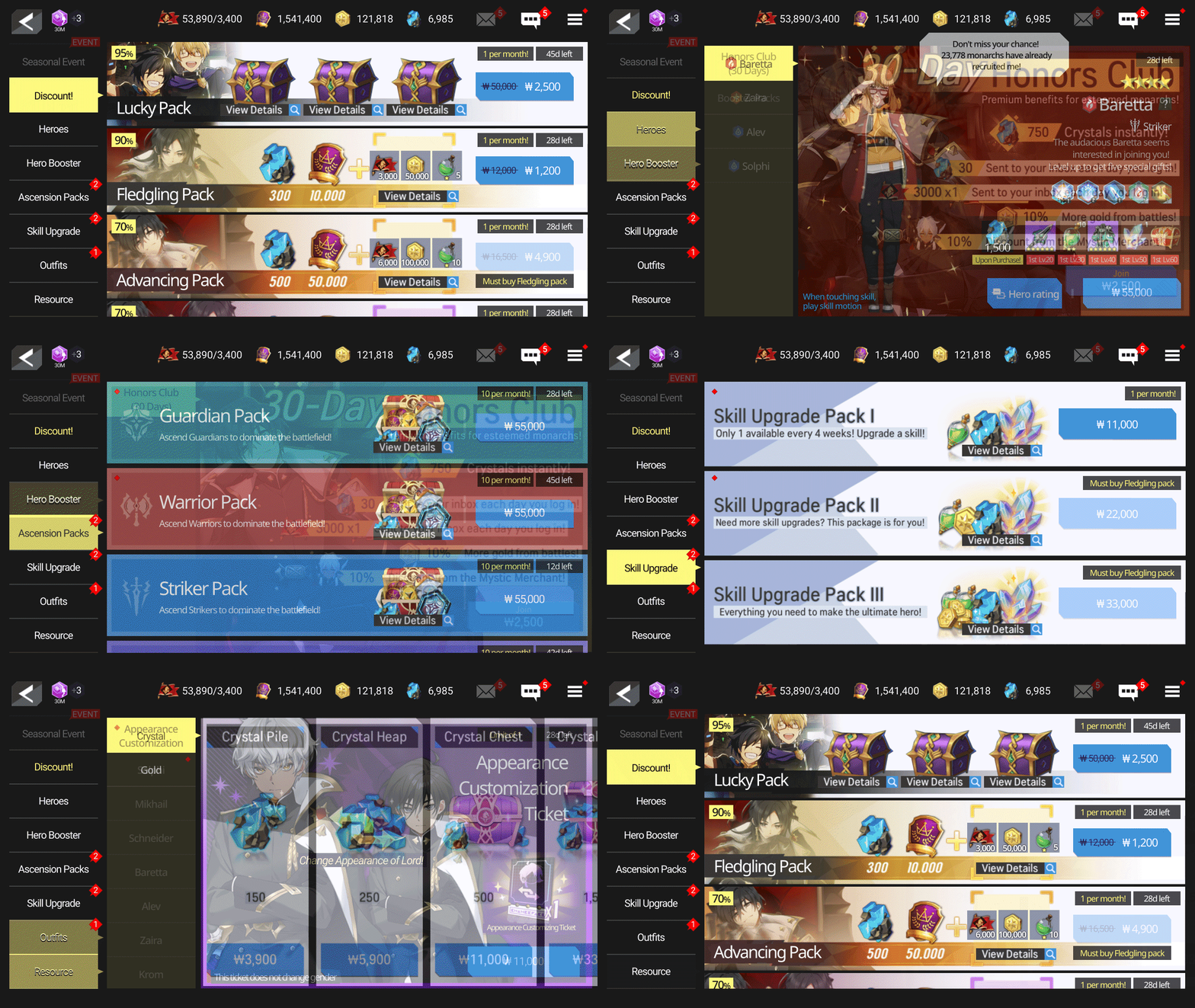
Shop, Mistic shop, Alliance shop
• Use the vertical layout. Players can view as many items as possible with a small movement of the right hand.
• Shop _ Improve layout for getting more information easily on one page, group similar contents for easy understanding. Players understand products at a glance and find them quickly.
• Shop _ Add 'Heroes rating' to read public evaluation. Players usually find public opinion when they consider buying heroes.
• Mystic shop _ Send push alarm to players' mobile when its item list refresh. So they don't have to check external channels to know new items.
VALIDATION
LOH Players Satisfaction Survey on Twitter (Feb 2/21 - Feb 8/21)
• I got 788 responses, and analyze 725 after data cleaning
• Though UI changes easily get negative feedback from users,
overall satisfaction of prototype significantly improved (5.64 → 7.23)
• Prototype satisfaction is higher than current across every player level section
• Prototype satisfaction is higher than current across every feature apart from Main lobby and Login page
• Alliance raid had the lowest score and increased to the highest.
Presumably, it was the result of solving the player's most thorny problems.
(Player could know 'current participating player' in the prototype)
• Main lobby score decreased. Presumably, players felt more immersed in the current interaction,
though it was difficult to find information. (Current - Touching character modelings to enter each content)
WHAT I LEARN
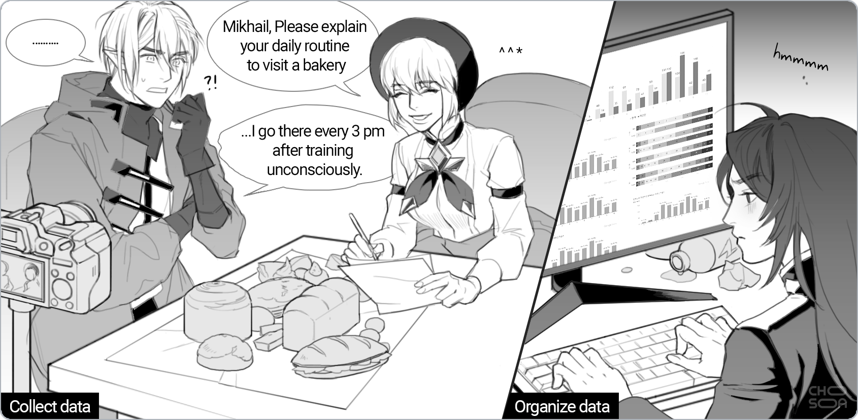
• I appreciate lots of answers I received, though it was a personal study.
I could get more than 80% of responses in 22 hours on Twitter RT, Medium traffic, and the survey.
• I should replace short-answer questions with multiple choice.
I did not analyze a total of 1,172 responses because of the quantity.
• Always think about Where the trade-off between function and immersion.
Online games are long-term services, have lots of accumulated features and the circulation of players.
